简介
ShapeBorder 用于设置形状和轮廓,比如圆形,矩形,圆角矩形等。常用于 Container 中。
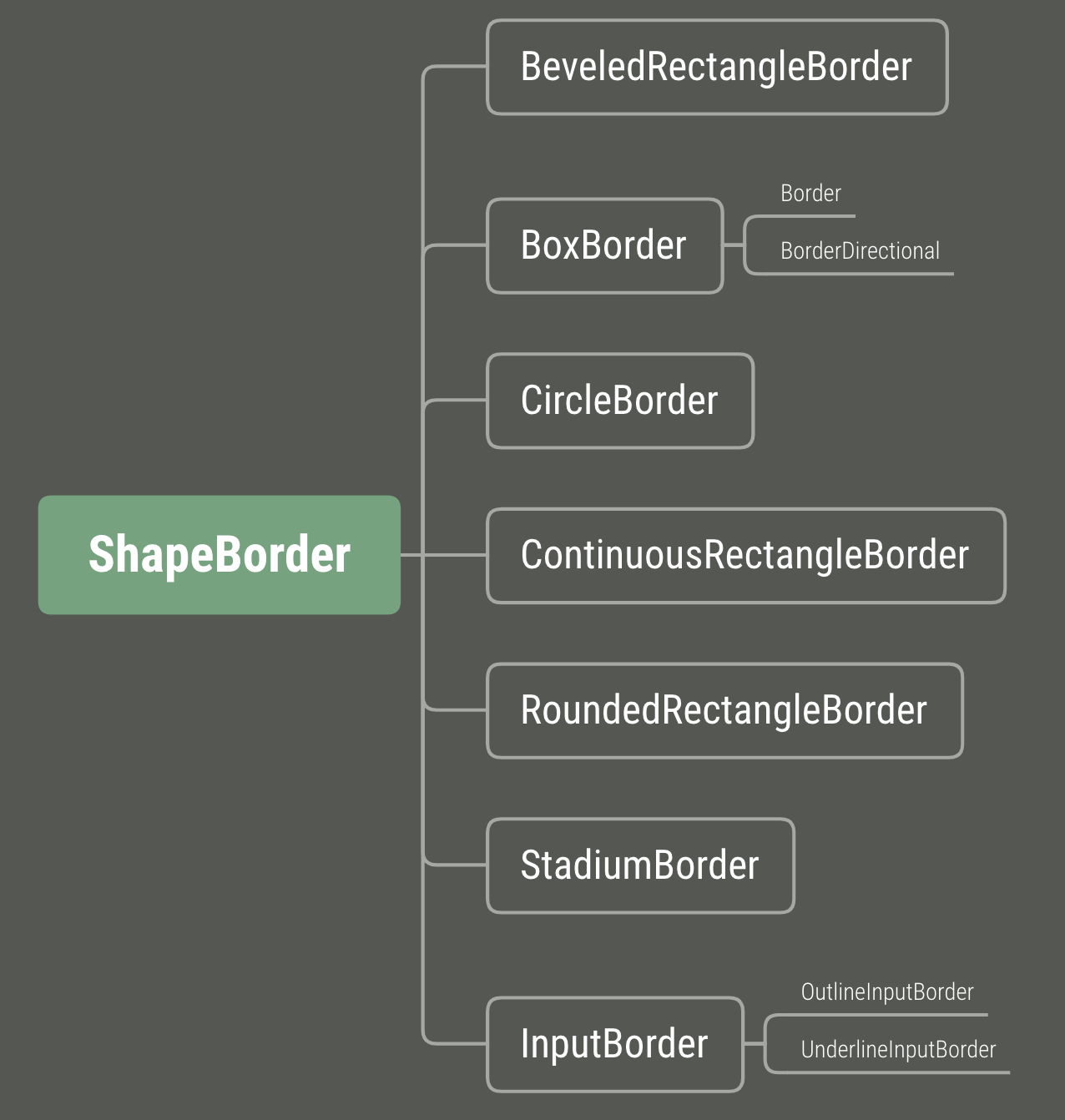
继承结构如下:
- ShapeBorder【abstract】
- BeveledRectangleBorder
- BoxBorder【abstract】
- CircleBorder
- ContinuousRectangleBorder
- RoundedRectangleBorder
- StadiumBorder
- InputBorder【abstract】
- OutlineInputBorder
- UnderlineInputBorder
其中 ShapeBorder、BoxBorder、InputBorder 是抽象父类。InputBorder 通常用于输入框相关的。
类的关系图
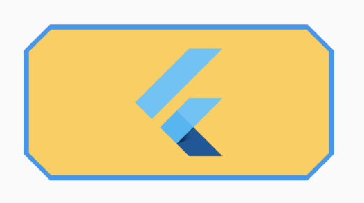
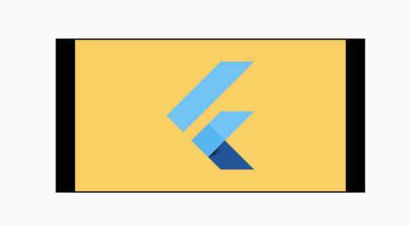
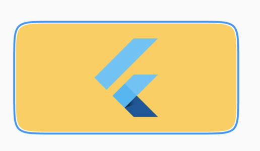
BeveledRectangleBorder
斜面圆角矩形
继承关系:
BeveledRectangleBorder > ShapeBorder
1
2
3
4
5
6
7
8
9
10
11
12
13
14
15
16
17
18
19
20
21
22
23
| Widget _beveledRectangleBorder() {
return Center(
child: Container(
width: 240,
height: 120,
margin: EdgeInsets.all(16),
decoration: ShapeDecoration(
image: DecorationImage(
image: AssetImage('lib/assets/img_flutter.png'),
fit: BoxFit.cover,
),
shape: BeveledRectangleBorder(
borderRadius: BorderRadius.circular(20),
side: BorderSide(
width: 2,
color: Colors.blue,
style: BorderStyle.solid,
),
),
),
),
);
}
|
效果如下:
BoxBorder
BoxBorder主要掌管边线方面的事,自身是abstract,不能直接用
BoxBorder官方说明
Base class for box borders that can paint as rectangles, circles, or rounded rectangles.
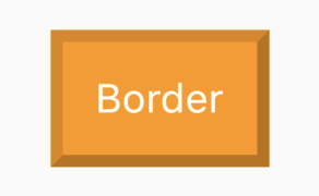
Border
继承关系:
Border > BoxBorder > ShapeBorder
Border官方说明
A border of a box, comprised of four sides: top, right, bottom, left.
1
2
3
4
5
6
7
8
9
10
11
12
13
14
15
16
17
18
19
20
21
22
| Widget _border() {
return Center(
child: Container(
margin: EdgeInsets.all(16),
padding: EdgeInsets.all(16),
decoration: ShapeDecoration(
color: Colors.orange,
shape: Border(
top: BorderSide(width: 6.0, color: Colors.black12),
left: BorderSide(width: 6.0, color: Colors.black12),
right: BorderSide(width: 6.0, color: Colors.black26),
bottom: BorderSide(width: 6.0, color: Colors.black26),
),
),
child: Text(
"Border",
style: TextStyle(color: Colors.white, fontSize: 20),
),
),
);
}
|
效果图:
BorderDirectional
继承关系:
BorderDirectional > BoxBorder > ShapeBorder
BorderDirectional 通过 top,bottom,start,end分别控制上下左右的边线
边线对象BorderSide
1
2
3
4
5
6
7
8
9
10
11
12
13
14
15
16
17
18
19
20
21
22
23
24
25
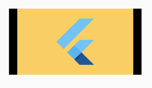
| Widget _borderDirectional() {
return Center(
child: Container(
width: 240,
height: 120,
margin: EdgeInsets.all(16),
decoration: ShapeDecoration(
image: DecorationImage(
image: AssetImage('lib/assets/img_flutter.png'),
fit: BoxFit.cover,
),
shape: BorderDirectional(
start: BorderSide(color: Colors.black, width: 15),
end: BorderSide(color: Colors.black, width: 15),
top: BorderSide(
color: Colors.black,
),
bottom: BorderSide(
color: Colors.black,
),
),
),
),
);
}
|
效果如下:
只设置左右的BorderSide
1
2
3
4
5
6
7
8
9
10
11
12
13
14
15
16
17
18
19
| Widget _borderDirectional2() {
return Center(
child: Container(
width: 240,
height: 120,
margin: EdgeInsets.all(16),
decoration: ShapeDecoration(
image: DecorationImage(
image: AssetImage('lib/assets/img_flutter.png'),
fit: BoxFit.cover,
),
shape: BorderDirectional(
start: BorderSide(color: Colors.black, width: 15),
end: BorderSide(color: Colors.black, width: 15),
),
),
),
);
}
|
效果如下:
CircleBorder
圆形边框。
继承关系:
CircleBorder > ShapeBorder
1
2
3
4
5
6
7
8
9
10
11
12
13
14
15
16
17
18
| Widget _circleBorder1() {
return Center(
child: Container(
width: 120,
height: 120,
margin: EdgeInsets.all(16),
decoration: ShapeDecoration(
image: DecorationImage(
image: AssetImage('lib/assets/img_flutter.png'),
fit: BoxFit.cover,
),
shape: CircleBorder(
side: BorderSide(),
),
),
),
);
}
|
效果如下:
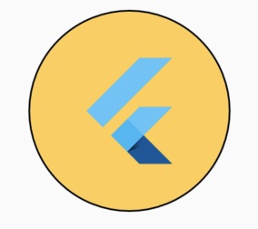
上面的是使用默认参数的效果
通过设置BorderSide来设置边框颜色和宽度,以及是否显示边框
1
2
3
4
5
6
7
8
9
10
11
12
13
14
15
16
17
18
19
20
21
22
23
| Widget _circleBorder2() {
return Center(
child: Container(
width: 120,
height: 120,
margin: EdgeInsets.all(16),
decoration: ShapeDecoration(
image: DecorationImage(
image: AssetImage('lib/assets/img_flutter.png'),
fit: BoxFit.cover,
),
shape: CircleBorder(
side: BorderSide(
width: 10,
color: Colors.blue,
style: BorderStyle.solid,
),
),
),
),
);
}
|
效果如下:

ContinuousRectangleBorder
平滑过渡的矩形边框
继承关系:
ContinuousRectangleBorder > ShapeBorder
1
2
3
4
5
6
7
8
9
10
11
12
13
14
15
16
17
18
19
20
21
22
23
24
|
Widget _continuousRectangleBorder() {
  return Center(
    child: Container(
      width: 240,
      height: 120,
      margin: EdgeInsets.all(16),
      decoration: ShapeDecoration(
        image: DecorationImage(
          image: AssetImage('lib/assets/img_flutter.png'),
          fit: BoxFit.cover,
        ),
        shape: ContinuousRectangleBorder(
          borderRadius: BorderRadius.circular(40),
          side: BorderSide(
            width: 2,
            color: Colors.blue,
            style: BorderStyle.solid,
          ),
        ),
      ),
    ),
  );
}
|
效果如下:
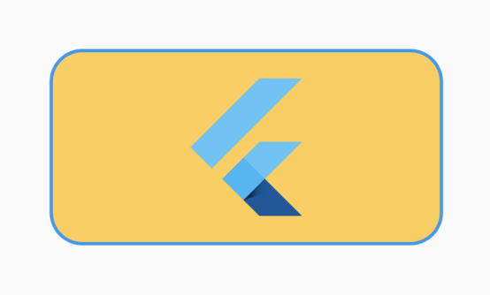
RoundedRectangleBorder
圆角矩形。
继承关系:
RoundedRectangleBorder > ShapeBorder
1
2
3
4
5
6
7
8
9
10
11
12
13
14
15
16
17
18
19
20
21
22
23
| Widget _roundedRectangleBorder() {
return Center(
child: Container(
width: 240,
height: 120,
margin: EdgeInsets.all(16),
decoration: ShapeDecoration(
image: DecorationImage(
image: AssetImage('lib/assets/img_flutter.png'),
fit: BoxFit.cover,
),
shape: RoundedRectangleBorder(
borderRadius: BorderRadius.circular(20),
side: BorderSide(
width: 2,
color: Colors.blue,
style: BorderStyle.solid,
),
),
),
),
);
}
|
效果如下:
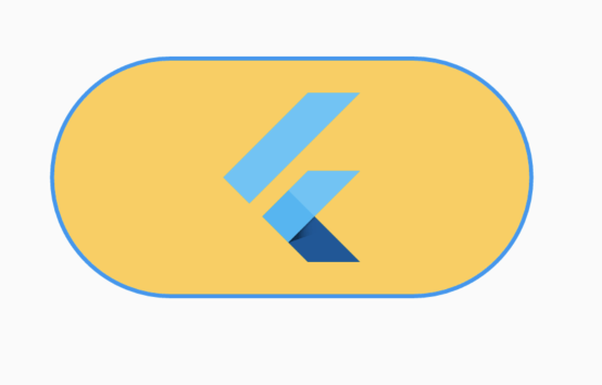
StadiumBorder
体育场形状。即两边是半圆。
继承关系:
StadiumBorder > ShapeBorder
1
2
3
4
5
6
7
8
9
10
11
12
13
14
15
16
17
18
19
20
21
22
| Widget _stadiumBorder() {
return Center(
child: Container(
width: 240,
height: 120,
margin: EdgeInsets.all(16),
decoration: ShapeDecoration(
image: DecorationImage(
image: AssetImage('lib/assets/img_flutter.png'),
fit: BoxFit.cover,
),
shape: StadiumBorder(
side: BorderSide(
width: 2,
color: Colors.blue,
style: BorderStyle.solid,
),
),
),
),
);
}
|
效果如下:
继承关系:
InputBorder > ShapeBorder
官方说明:
Defines the appearance of an [InputDecorator]’s border.
An input decorator’s border is specified by [InputDecoration.border].
The border is drawn relative to the input decorator’s “container” which
is the optionally filled area above the decorator’s helper, error,and counter.
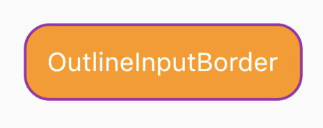
常用的输入边框,有2个衍生子类OutlineInputBorder 和UnderlineInputBorder
继承关系:
OutlineInputBorder > InputBorder > ShapeBorder
1
2
3
4
5
6
7
8
9
10
11
12
13
14
15
16
17
18
19
| Widget _outlineInputBorder() {
return Center(
child: Container(
margin: EdgeInsets.all(16),
padding: EdgeInsets.all(16),
decoration: ShapeDecoration(
color: Colors.orange,
shape: OutlineInputBorder(
borderSide: BorderSide(width: 2.0, color: Colors.purple),
borderRadius: BorderRadius.circular(20.0),
),
),
child: Text(
"OutlineInputBorder",
style: TextStyle(color: Colors.white, fontSize: 20),
),
),
);
}
|
效果如下:
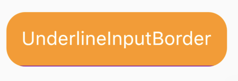
继承关系:
UnderlineInputBorder > InputBorder > ShapeBorder
1
2
3
4
5
6
7
8
9
10
11
12
13
14
15
16
17
18
19
| Widget _underlineInputBorder() {
return Center(
child: Container(
margin: EdgeInsets.all(16),
padding: EdgeInsets.all(16),
decoration: ShapeDecoration(
color: Colors.orange,
shape: UnderlineInputBorder(
borderSide: BorderSide(width: 2.0, color: Colors.purple),
borderRadius: BorderRadius.circular(20.0),
),
),
child: Text(
"UnderlineInputBorder",
style: TextStyle(color: Colors.white, fontSize: 20),
),
),
);
}
|
效果如下: